Meet the new CTcue query builder
How do we build a user interface that helps people look through massive amounts of data in an easy and intuitive way? It’s not an easy problem to solve! It requires trial and error and iteration upon iteration. And what do you do once you have a stable application that users are happy with? You redesign it from the ground up of course!
Jokes aside, part of the decision to redesign the application came from a technical perspective. The frameworks we used were getting out of date (Koa V2, AngularJS). The code that we worked on over the years with a small team wasn’t as clean as we would have liked. In the long run, it got less maintainable and needed overhauls too include new features. Moreover, we learned more about the way people wanted to use our application. With a technical rebuild on the horizon this could also be a time to look at the lessons we learned and redesign our interface for the future.
Lessons learned
When we started designing our application the goal was to make the EHR accessible for doctors and research nurses. Existing AND/OR query builders seemed overkill for the expected use-cases. We wanted to keep it simple and ultimately decided to build our own version. In our query builder, the individual terms were linked visually by an AND/OR block and these could be toggled separately. It was a very flexible system which people found easy to use, but it could also backfire in unexpected ways when not configured right. You could write a query that would end up with no results being found or the results you would get not being what you wanted because an AND block should have been an OR. It only got more complicated when we introduced the concepts of groups as brackets ([ ]). Any question that needed group logic would require a lot of attention, because it was easy to get wrong.

Image 1: The above query is easy to make, but without using a group you could end up with unexpected results
Once the possibilities of our application became clearer, our users also wanted to create more complex queries. In addition, they had loads of ideas about what features we could add. At some point the puzzle pieces didn’t quite fit anymore in the old interface. We wanted to find a way to simplify the logic in our query builder and lower the chances of our users shooting themselves in the foot.
As the amount of documents in hospitals grew into the 100s of millions the scalability of the interface was a concern because we were getting more search categories than initially anticipated. For example, surgeries, admissions, and the forms that come with them. For each category the amount of fields to search in was growing too. And every new field added, which users wanted to search, would be added as an empty input in the sidebar. This quickly ended up becoming a big list to scroll through to find the actual things you wanted to filter on.
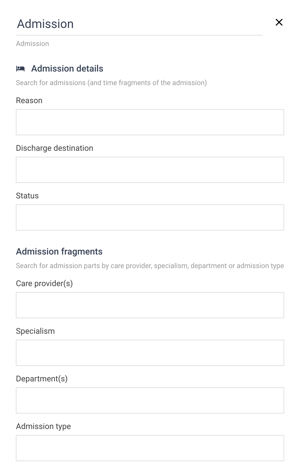
Image 2: So many empty inputs. Where do I even start? I don’t need 80% of these fields.
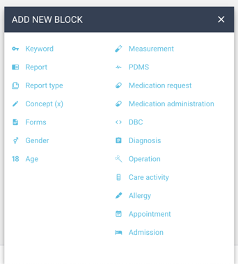
Image 3: This list has been getting longer and longer since the start of CTcue
The biggest learning curve in our application is how to build a “good” query. Currently, the flow isn’t great. First you may find 300 patients and then adding a single filter yields to zero. And every time you make a small change to your query, you have to run the search to see the effects so it can take a while. We want to help users get more confidence in the queries they are building and give more feedback on what results they can expect before they have to hit the search button.
Putting it into practice
After reviewing feedback from the first version of the query builder, and lots of discussions, and whiteboard drawings (and more drawings), we came up with a design that works on the basis of groups. It looks in line with more traditional query builder interfaces, but we also added our own flavour to it to make sure it would fit all the possible needs you could have. A group can have terms in it or other groups and each group has a rule that defines the logic it uses between the items that are in it. A group has a logic rule and you can say if you want All (AND) or Any (OR) of the terms. All means that any patient found needs to have everything you added to this group. Any means as long as a patient has one of the following I want to find them.
While still offering all the same functionality as the current query builder it is more strict in the way we handle the AND/OR logic. It should help avoid the problem of ending up with queries that have no results, because of a problem with the logic. From a technical perspective this also helps us not having to deal with strange cases where the system would have to guess what you actually meant and trying to correct the logic behind the scenes.
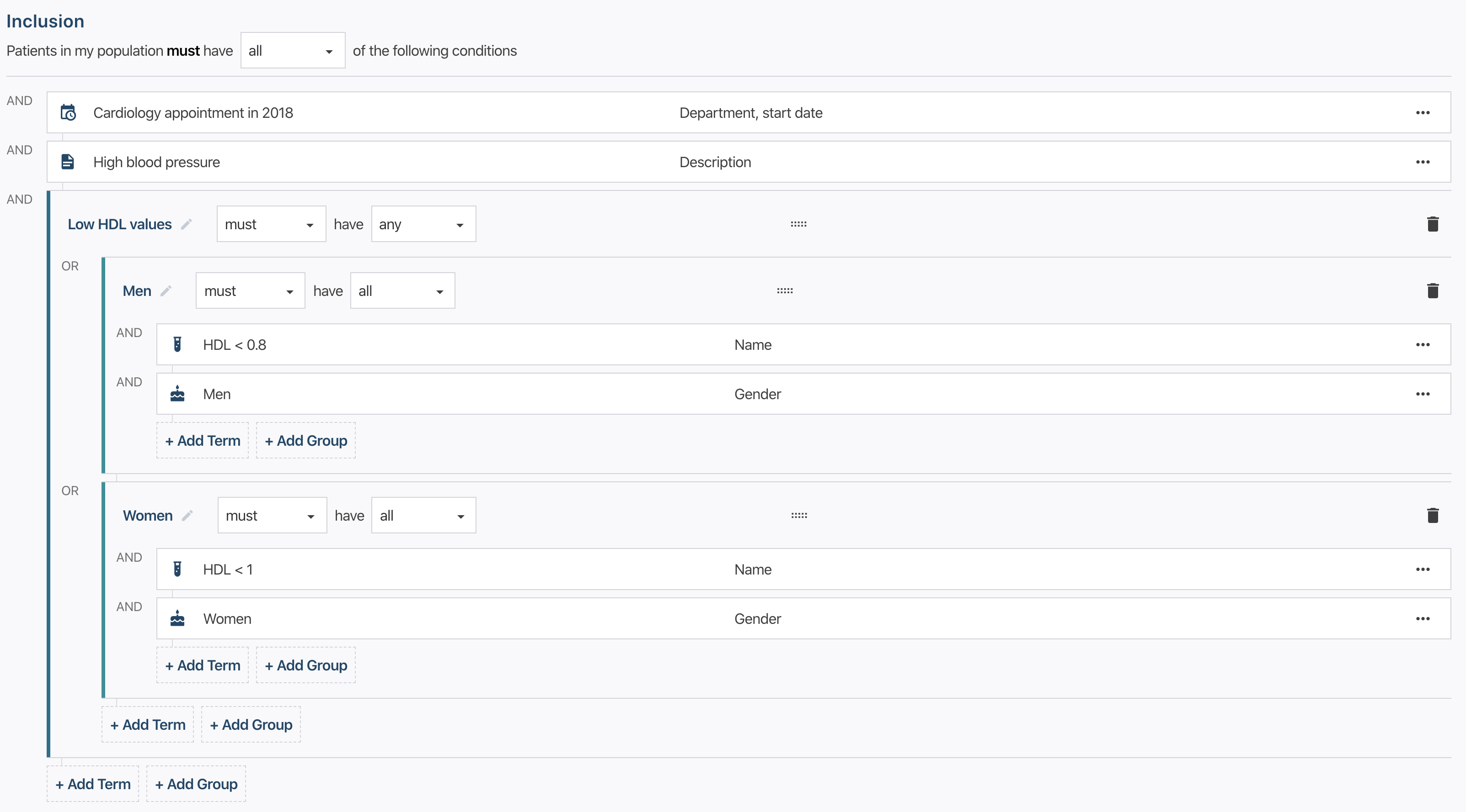
Image 4: Logic is now exclusively tied to groups
Another interface problem we were having had to do with the growth of available search categories and fields to search in. We thought about the best way to handle this in a future proof way and we decided to make some changes to the flow of adding a term and redesigned the sidebar.
Remember that small popup we had when you want to add a term and could pick from a list of available categories? (See image 3) It was getting a bit cramped in there and having to adjust the size by a few pixels every time we wanted to add a new category wasn’t ideal. In the new query builder when you want to add a term we now use a lot more screen real estate to scale to the growing data easily and give you some helpful functionality to boot. We still have a list of all available categories but we also added a search bar that has a dual function. You can use it to filter the list of available categories or you could type in the actual thing you are looking for (e.g. Heart attack) and we can give you suggestions on which category you probably want to use.
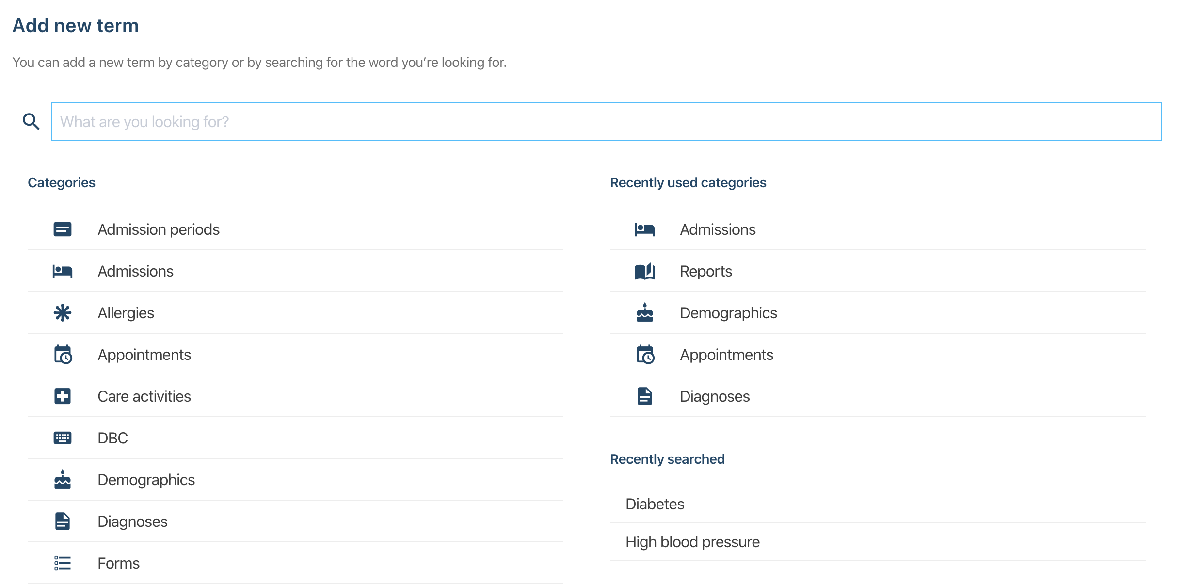
Image 5: The new way to add terms. Also shows recently used categories and searches
Once you add a new term to your query we still have a sidebar, but we made some changes to it. Instead of seeing a list of empty inputs we show a list fields you can use to filter on. You now have full control over what fields you actually want to search on and this should alleviate some confusion about what happens when an input field is left blank.
Besides being more user friendly (you can be the judge of that), another bonus of this design and the way it has been built technically, is that it is now easier for us to add new categories and fields to the query builder. With these changes, the interface scales much better with additional data.
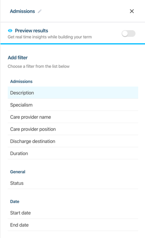
Image 6:Pick the field you want to actually filter on and leave the rest
To help users get more confidence in their query building skills we added a couple of features that can help them get more feedback from the system while building their query. The first thing we added is a patient count inside the query builder. While you are building a query this patient count constantly updates so you can keep track of the amount of patients you will find or the amount of patients you lose when adding a new term.
Another big feature is something we call live preview. Live preview shows you the results for a single term while editing it. It will update these results when you add, change or remove fields and can help you sharpen your query to get exactly the results you want.
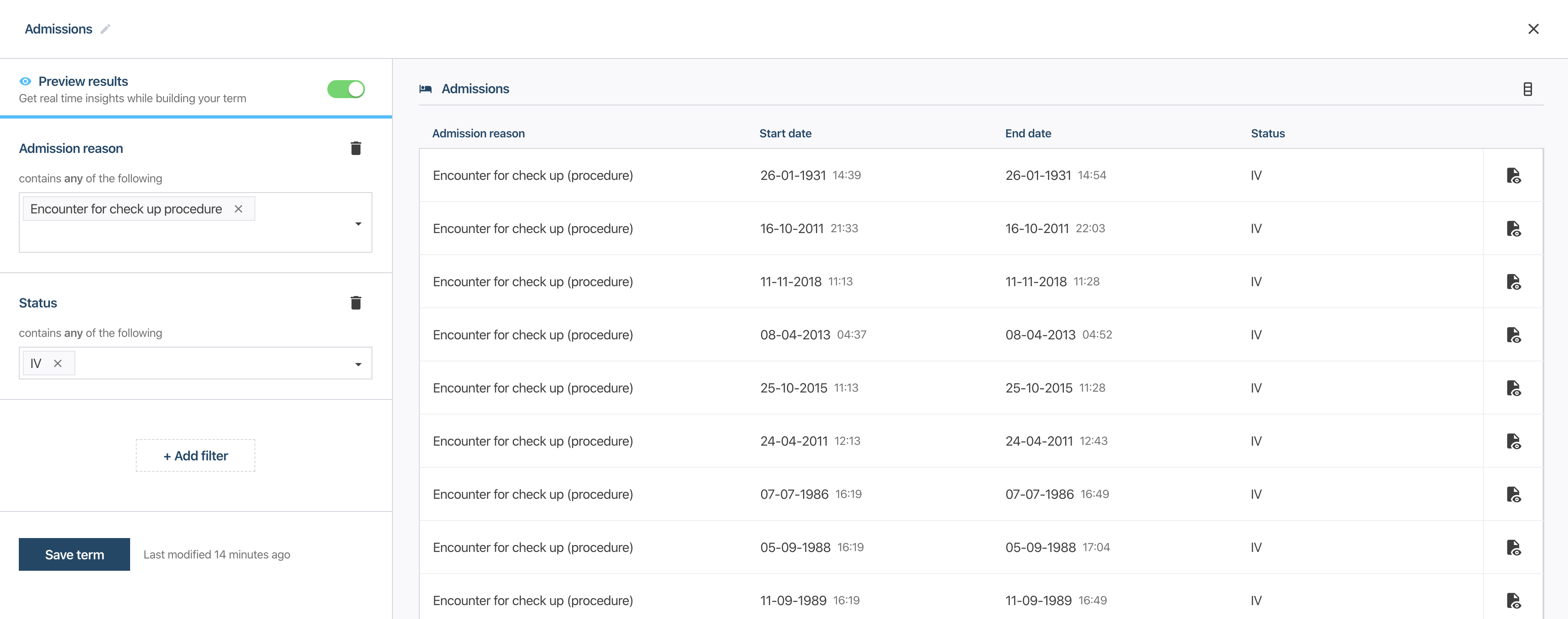
Image 7: Use live preview to get possible results while building your term
To improve is to change; to be perfect is to change often.
One of the philosophies we had during this redesign process was that the system should be explicit and clear in letting you know what it’s doing. We wanted to reduce some of the magic that was happening behind closed doors while making it more user friendly and intuitive. The redesign and creation of the new query builder over the last 1,5 years has been kept very small, not many people have seen what we are working on. Now it’s time to show the redesign to our users! We want to start testing and gather feedback on not just the query builder but all the aspects of the new application and continue to improve on the solid new foundation we have built.